
 I started to get interested in the work of Helen Lyon, especially her series of work called 'I'm not here to be a Muse'. I first saw the work of Helen Lyon in a Silvershot magazine and I felt that her work fitted quite well with the theme of obsession with beauty. Although One piece of work I found interesting was two modelling images one with a caption of "no tits, no cigarette, no talent", some of her mixed media work seem quite bold and harsh which is why i felt that this was a great piece of work to be inspired by as it reflects on the
harshness that beauty has on people. This side of the obsession with beauty could also allow me to branch off to the modelling side of beauty, as this would give me many opportunities to branch out my work and explore different experiences with the different obsessions with beauty whether it is in everyday life, the professional image or within the people who create the obsession.
 Helen Lyon's photograph's of women are highly intriguing and fascinating. They are small scale, muted colors and incongruous focus enables Lyon to portray a glimpsed intimacy.They are ethereal and glamorous pieces of work as they are the image of paired down antique luxury. Helen Lyon worked as a fashion photographer for many leading style magazine's including Harper's
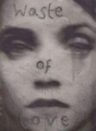
 Bazaar and her work has appeared in such titles as Vanity Fair. Lyon's mixed media are hand printed onto water color paper in editions of only 5. The images take her experience of fashion photography to another step, creating unsettling yet beautiful images that she has worked into with paints and inks and developing a story beyond the initial image. Their diminutive scale makes them highly intimate and very personal glimpses into the female psyche. Making the images appear special and highly intimate.Some people may find her work rather shocking yet subtle when they gain a first impression of the work as some of her pieces do gain a sharp reaction such as caption discriminating a woman as a "waste of love" however the way she portrays women can sometimes be alluring. The sharp grey-scale tones in some of her work to me is what gives her work the edge, if her work was to appear in color i feel that the images and the women them self would not appear so strong as they do in the black and white setting. Although the combination of images with lack of captions and images that have been what appears to be 'hand-written' on is quite intriguing, I do feel that maybe some of her images such as the two images above would of probably been made stronger by adding text that can make the viewer think twice about the photographs. Perhaps as the women appear so strong and independent, adding a written caption that makes them appear otherwise, makes them appear weak and maybe vulnerable would add to the images allure.
Are her images illustrations used in fashion magazines- do they sell clothes or are they more personal 'artworks'- what role do they have to the messages in the magazines. Is it Fine Art or Advertising- is there a crossover with this type of work?
ReplyDeleteText and Images Courtesy of Stephanie Hoppen Gallery.
ReplyDelete